….and then there was the “home office” room to contend with.
This room has some walls that are 12 feet high, was all white, has an inversion table in it (which is one of those things you hang upside down like a bat on, in order to stretch out your spine and muscles.) This belongs to the athlete in the house and will not be going anywhere, period. The room also comes with some very dated off white leather sofas which I do not like. At all. Period. Additionally, there is a computer workstation to deal with.
Unfortunately my husband loves the sofas so in light of all the other changes I’ve made…this sofa debate will just have to wait, so I had to work with it. Here is a photo of the room after I’d already added the framed lion print, end table, coffee table and lamps, but before actually beginning the painting process. You can see that even with adding pieces, the room is still “blah.”
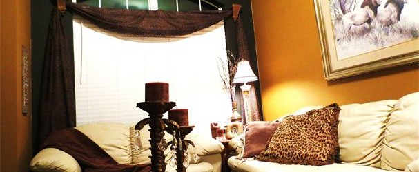
This room totally changes with paint to accent the 12 foot ceilings and wall nook . I chose black again, as the accent wall in the nooked area, for drama and depth, yet a different color than the living room for the other walls to add a touch of variety, yet still flows with the rest of the home.
I would normally never place a sofa in front of a window however, in this case, I am dealing with one entire wall taken up with a huge TV(another debate) as well as the conversion table contraption so I am having to do the best I can to fix up the man cave.
This room flows now with the rest of the house and it’s functional and cozy. He likes the warm, manly colors and doesn’t mind the dark brown and black animal print window swag or pillow!
The colors I used here were “Francesca” by Martha Stewart for the black and “Molasses” by Eddie Bauer Home. The goal was to use serious paint colors in order to compensate for the unstructured, bright creme leather set. (Did I mention yet that I do not care for these???) A side note would be that if you’ve never picked out paint colors…it’s very hard. It never looks the same as the tiny swatch, so if you don’t trust yourself, just use one of the recommended design colors at the paint center you go to. Each brand has interior design cards in different hues, that mix and match great interior colors and give you good ideas.
Again, these colors throughout this house are masculine and warm, which will go great with dark wood flooring which I plan to have installed in the future, which will look expensive and be highly durable as well which is important since the long term plan is to turn this home into another rental property.
The next two rooms will be great fun,and include a total master bedroom overhaul !
-September 29,2012
–SDS


